Tigaฐิกา
A Thai-Latin newspaper typeface, made at EsadType in Amiens, France — Sirin's graduate project, reinterpreted from 19th-century Thai wood type. ตัวพิมพ์หนังสือพิมพ์ไทย-ละติน ผลงานจบการศึกษาของศิรินที่ EsadType เมืองอาเมียง ประเทศฝรั่งเศส ตีความใหม่จากตัวพิมพ์ไม้ไทยศตวรรษที่ 19
Tiga is a Thai-Latin typeface family designed for printed and online news media. Its initial idea was inspired and reinterpreted from Thai wood type — first used as a headline face in 19th-century Thai newspaper presses run by Chinese communities in Thailand. ฐิกา คือตระกูลตัวพิมพ์ไทย-ละติน ออกแบบมาสำหรับสื่อข่าวทั้งสิ่งพิมพ์และออนไลน์ แนวคิดเริ่มต้นได้แรงบันดาลใจและตีความใหม่จากตัวพิมพ์ไม้ของไทย ซึ่งเคยใช้เป็นตัวพาดหัวในโรงพิมพ์หนังสือพิมพ์ไทยที่ดำเนินการโดยชุมชนชาวจีนในศตวรรษที่ 19
Made during her postgraduate typeface design course at EsadType in Amiens, France (2018–2020), Tiga later earned Sirin the Gerrard Unger scholarship. She has also designed typefaces for foundries including Typotheque, TypeTogether and Sharp Type. ผลิตขึ้นระหว่างเรียนปริญญาโทออกแบบตัวพิมพ์ที่ EsadType เมืองอาเมียง ประเทศฝรั่งเศส (2018–2020) ฐิกาทำให้ศิรินได้รับทุน Gerrard Unger scholarship ในเวลาต่อมา เธอยังออกแบบตัวพิมพ์ให้กับสำนักออกแบบอย่าง Typotheque, TypeTogether และ Sharp Type
Its family plan runs from Titling through Text and Caption down to Micro, with an Italic. แผนตระกูลตัวพิมพ์ไล่ตั้งแต่ Titling, Text และ Caption ลงไปถึง Micro พร้อมตัวเอียง

Not about imitating shapes from one another, but the stroke of writing within the same hand. ไม่ใช่การเลียนแบบรูปทรงของกันและกัน แต่เป็นเรื่องของเส้นสายการเขียนที่มาจากมือเดียวกัน— on designing Tiga's Thai and Latin together— ว่าด้วยการออกแบบฐิกาทั้งไทยและละตินไปด้วยกัน
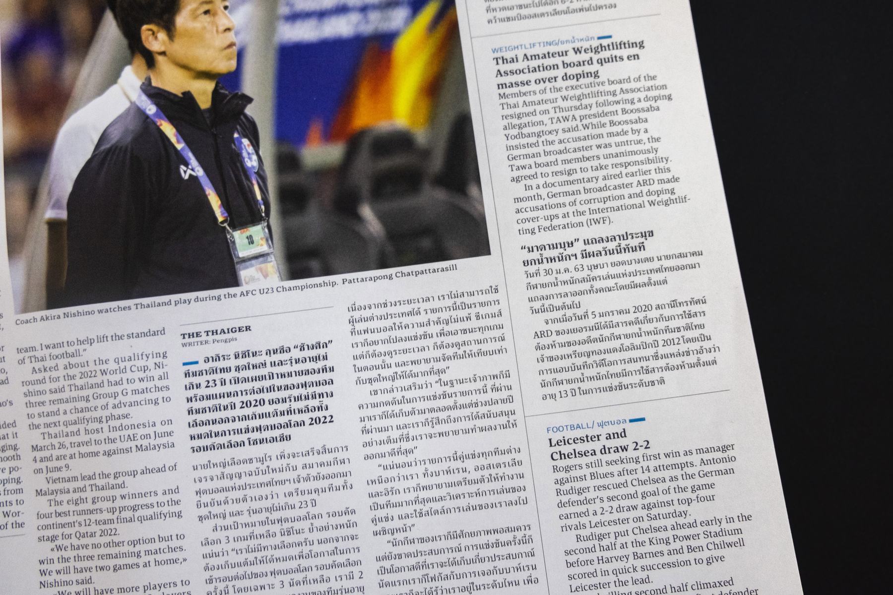 Tiga ฐิกา in a printed newspaperฐิกาบนหน้าหนังสือพิมพ์จริงPlate 02
Tiga's design space follows size- and purpose-specific adjustments for reading from big to small, as found widely in newspapers — a wide range of weights built to handle the complex typographic hierarchy of a news page, from titling down to caption and micro sizes. พื้นที่การออกแบบของฐิกาเป็นไปตามแนวคิดการปรับตามขนาดและจุดประสงค์การใช้งาน ตั้งแต่ตัวใหญ่ไปจนถึงตัวเล็ก ตามที่พบได้ทั่วไปในหนังสือพิมพ์ — มีน้ำหนักหลากหลายเพื่อรองรับลำดับชั้นการจัดวางที่ซับซ้อนของหน้าข่าว ตั้งแต่ระดับพาดหัวไปจนถึงคำบรรยายและขนาดจิ๋ว
Tiga was the result of trials and errors: each script — Thai and Latin — was designed on its own manners, then developed on its parameters so the two could be assembled together as one family. ฐิกาคือผลลัพธ์จากการลองผิดลองถูก แต่ละระบบอักษร — ไทยและละติน — ถูกออกแบบตามลักษณะเฉพาะของตัวเอง ก่อนพัฒนาให้ทั้งสองประกอบเข้าด้วยกันเป็นตระกูลเดียว

Researchค้นคว้า
Studying 19th-century Thai wood type — the headline face of Thai newspaper presses once run by Chinese communities in Thailand.ศึกษาตัวพิมพ์ไม้ไทยศตวรรษที่ 19 — ตัวพาดหัวของโรงพิมพ์หนังสือพิมพ์ไทยที่เคยดำเนินการโดยชุมชนชาวจีนในไทย
Drawวาด
Reinterpreting the wood type into a design space of size- and purpose-specific adjustments, from titling down to micro text.ตีความตัวพิมพ์ไม้ใหม่เป็นพื้นที่ออกแบบที่ปรับตามขนาดและจุดประสงค์การใช้งาน ตั้งแต่ระดับพาดหัวไปจนถึงตัวอักษรขนาดจิ๋ว
Pairจับคู่
Designing Thai and Latin each on its own manners, then developing both on shared parameters to be assembled as one family.ออกแบบไทยและละตินตามลักษณะเฉพาะของแต่ละระบบ ก่อนพัฒนาทั้งคู่บนพารามิเตอร์ร่วมให้ประกอบเป็นตระกูลเดียวกัน
Refineขัดเกลา
A wide range of weights, tested through trial and error, to handle the complex typographic hierarchy of a news page.น้ำหนักหลากหลาย ทดสอบผ่านการลองผิดลองถูก เพื่อรองรับลำดับชั้นการจัดวางที่ซับซ้อนของหน้าข่าว
Tiga ฐิกา, EsadType, 2020. Selected specimens from the graduate project.ฐิกา, EsadType, 2020 ตัวอย่างจากผลงานจบการศึกษา
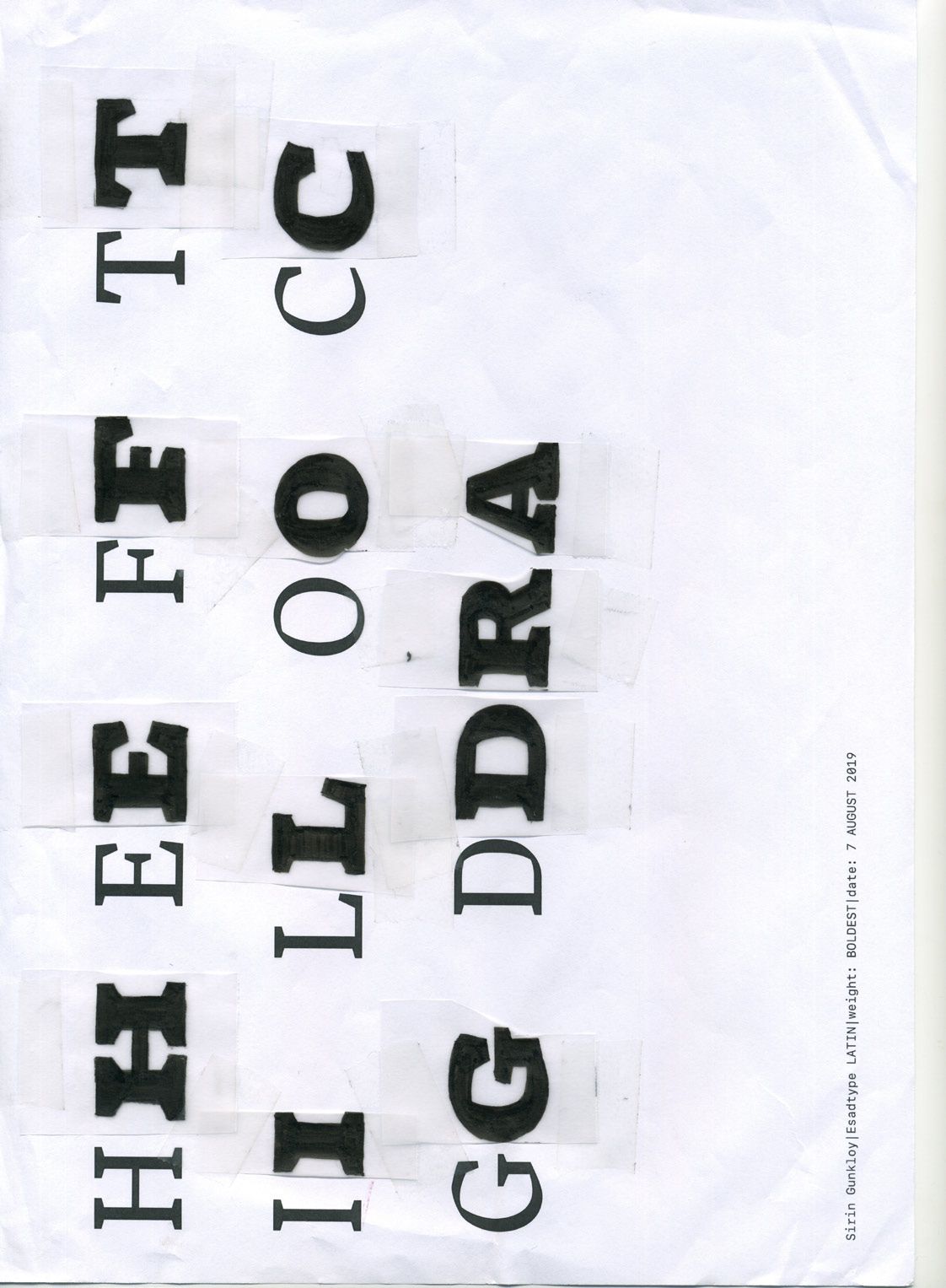
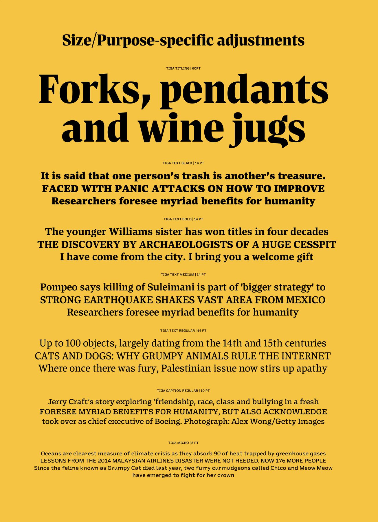
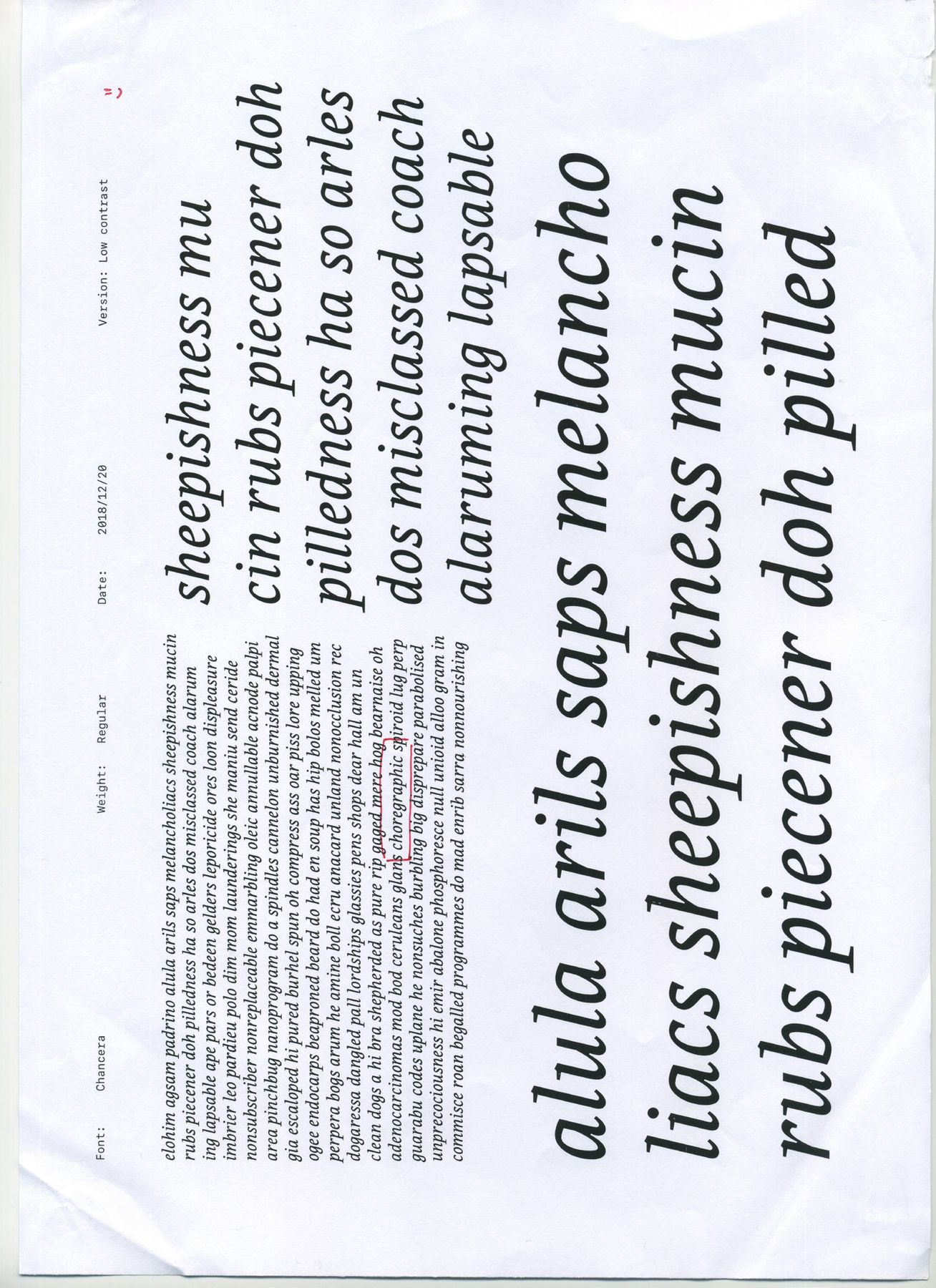
Tiga is built for reading from big to small — the size- and purpose-specific adjustments found widely in newspapers. ฐิกาถูกสร้างมาเพื่อการอ่านตั้งแต่ขนาดใหญ่ไปจนถึงขนาดเล็ก — การปรับตามขนาดและจุดประสงค์ที่พบได้ทั่วไปในหนังสือพิมพ์